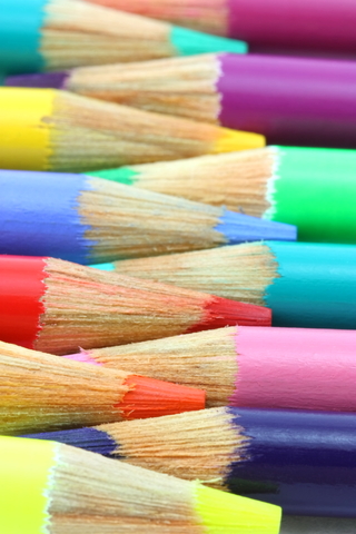
Color harmony is a fundamental principle in art and design, including canvas printing. The thoughtful arrangement of colors can greatly impact the visual appeal and emotional response to a print. In this article, we will explore various color harmonies and how to apply them in canvas printing.
- Complementary Colors: Complementary colors are pairs of colors that are opposite each other on the color wheel. Examples include blue and orange, or red and green. Using complementary colors in canvas prints creates high contrast and visual impact.
- Analogous Colors: Analogous colors are adjacent to each other on the color wheel. These colors share similar temperature and create a harmonious and cohesive look. For example, using shades of blue and green in a canvas print evokes a sense of tranquility and natural harmony.
- Monochromatic Colors: Monochromatic color schemes involve using variations of a single color. This approach creates a sophisticated and unified look. Consider using different shades and tints of a specific color, such as various tones of blue, for a monochromatic canvas print.
- Triadic Colors: Triadic color schemes consist of three colors evenly spaced around the color wheel. They create a vibrant and dynamic visual impact. Examples of triadic combinations include yellow, red, and blue, or orange, green, and purple. Use triadic color schemes to add energy and excitement to your canvas prints.
- Split-Complementary Colors: Split-complementary color schemes involve a base color and two colors adjacent to its complement. For instance, pairing blue with yellow-orange and red-orange. This color harmony offers a balanced yet visually interesting composition.
- Custom Color Harmonies: Feel free to experiment and create your custom color harmonies. The color wheel provides a guide, but don’t be afraid to explore unconventional combinations. Trust your instincts and create unique and captivating color schemes that resonate with your artistic vision.
When planning your canvas prints, consider the emotional impact and desired atmosphere you want to convey. Understanding color harmonies empowers you to choose the most suitable color combinations, resulting in visually engaging and harmonious canvas prints.